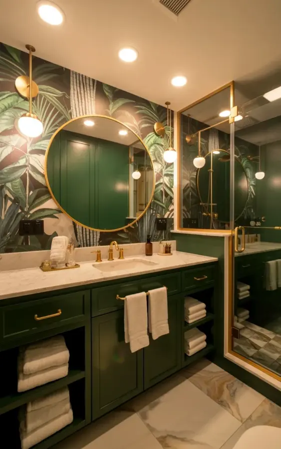
The light in this room hits that dark forest green vanity just right, and honestly, the whole bathroom transformation hinges on that one bold choice. If you are here because you pinned that photo of the botanical wallpaper and brass pulls, you probably have a vision for a green bathroom that feels both dramatic and calm. But getting from that Pinterest screenshot to a real, finished room is where most people stumble. Over the years, I have watched countless DIYers and even some pros make the same five or six errors when trying to pull off this exact look.
This space with the marble vanity top and gold mirror looks effortless, but it is actually a tightrope walk of texture and tone. The wallpaper screams for attention while the fixtures whisper, and balancing that dynamic is trickier than it looks. So, let me walk you through the common mistakes I see with this style, and how you can avoid them in your own home.
Mistake 1: Picking the Wrong Shade of Green Paint
Here is the thing, not all forest greens are created equal. I once painted a client’s vanity in a green that looked perfect in the can, but once the bathroom lights hit it, the color pulled a murky, swampy brown. It was a disaster. The reason is undertone, and it is unforgiving in a small space.
You want a shade that shifts elegantly between moody and fresh. Look for colors with a deep blue or teal undertone, not a yellow one. Benjamin Moore’s “Dark Harbor” or Farrow & Ball’s “Hague Blue” are classics, but you can also check out Sherwin Williams “Ripe Olive” if you want something slightly softer than the photo. Go dark, but keep the pigment rich.
Test the damn paint before you commit. Paint a large foam board and hold it against your actual wall, next to your actual wallpaper sample, in the natural light of the bathroom. What works in a north-facing room will look totally different in a south-facing one.
Mistake 2: Letting the Botanical Wallpaper Overwhelm the Room
A full room of large palm leaves can start to feel like you are being swallowed by a jungle, and not in a fun, spa-like way. The magic of the photo above is that the pattern has breathing room. The gray and green tones in the wallpaper recede slightly, allowing the vanity to remain the anchor of the room.
If you are looking to install botanical wallpaper, make sure there is visual space. Choose a pattern with plenty of negative space between the leaves, and stick to muted tones like sage, gray, and olive instead of high-contrast black and white. High contrast patterns will chop the room into tiny pieces and make it feel busy.
Also, consider the scale of the print. A giant oversized monstera leaf can dwarf a tiny powder room. Mid-sized fronds, like the palms in the reference image, tend to feel more sophisticated and less like a tiki bar.
Mistake 3: Treating Brass Hardware as an Afterthought
People think they can just grab any gold knob from the hardware store, slap it on, and call it a day. That is a surefire way to ruin the finish. The brass hardware in a green bathroom needs to be curated. It should feel substantial, not shiny and cheap.
When choosing your brass pulls and knobs, think about the finish. Do you want polished brass, antique brass, or unlacquered brass? For this specific look, I prefer a polished brass with a clear coating, or an antique brass with a warm, honeyed tone. Stay away from anything that looks too yellow or too pink.
And do not mix your metals. If your shower frame is brass, your mirror should be gold, and your sconces should be brass. You can have different shades of the same family (like a slightly brushed gold on the faucet and a brighter polished brass on the mirror), but don’t throw a random chrome fixture in there. It will scream “mistake” louder than any paint color could.
Mistake 4: Skipping the Marble Texture Game
The white marble countertop is doing a lot of heavy lifting in this design. It is not just a place to put your toothbrush; it is the light source that offsets the dark wood. If you swap it out for a solid white quartz, the whole room can feel a little flat and sterile.
I love a good Carrara or Calacatta marble slab, but here is a pro tip: you do not need the real stone. A high-quality porcelain slab with a marble look is incredibly durable and won’t stain like natural marble will. If you spill a green face mask on a marble vanity top, you’ll spend a week panicking about the etching.
Get the biggest slab you can. Tiny tiles or a small sink cutout will break up the surface and make the vanity look smaller. You want a seamless, smooth expanse of white with subtle gray veining to bounce light around the room.
Mistake 5: Forgetting the Light Needs to Flatter
Those wall-mounted brass sconces with glass globes are not just jewelry. They are the primary source of light for your face, and if you put them in the wrong spot, you are going to hate shaving or doing your makeup. The worst mistake is installing them too high.
The center of the sconce should be at eye level, usually around 60 to 66 inches from the floor, and they should be placed about 36 to 40 inches apart. You want the light to fill in the shadows on your face, not illuminate the top of your head. Additionally, make sure they are on a dimmer switch. A green bathroom can be an absolute cave in the evening, so you need the ability to soften the glow and make it feel cozy, not like a surgical suite.
Mistake 6: Ignoring the Floor Transition
This is a subtle one that even seasoned renovators get wrong. The beige marble-look tile on the floor in the photo feels neutral, letting the green and white shine. But if you pick a floor tile with a yellow undertone, it will clash with the crisp white marble counter and the cool green in the wallpaper.
The floor should bridge the two main elements. A warm beige, a soft taupe, or even a herringbone pattern in a muted oak tone works beautifully. Just do not choose a grey tile that is too cool and blue, or it will look like the floor is having a fight with the wall. I always tell people to bring all their samples home and lay them on the floor together. Look at them in the morning, at noon, and at night.
The Editing Phase
Once you have the major pieces in place, the real test is restraint. The final detail that makes this room look high-end is what is *not* in it. You need to ruthlessly edit the counter. A soap pump in brushed brass, a single simple tray for a watch, and maybe a small plant. That is it.
Avoid the urge to fill the walls with more art or to add a bunch of themed accessories. The botanical wallpaper is your art. The room needs to breathe.
Ok so, before you buy a single can of paint, take a deep breath. Commit to the mood, trust the materials, and measure your space twice.
If you are planning this exact style and want a second opinion on your material choices, I am happy to help in the comments. And do not forget to send me a photo when you are done, I love seeing these green bathrooms come to life.
This post was researched and drafted with AI assistance, then personally reviewed and edited by Copper Finds Vera before publishing.
Leave a Comment