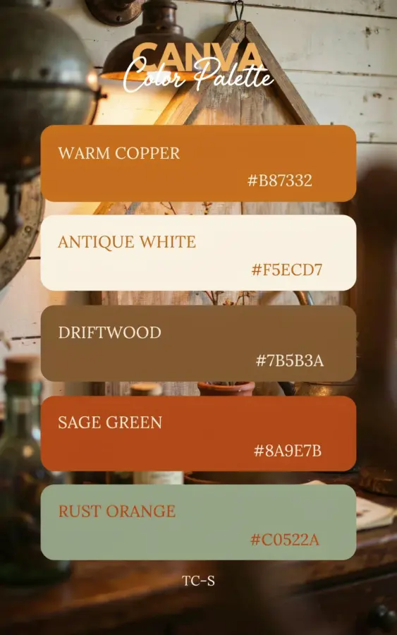
If you have been scrolling through home decor feeds lately, you have likely noticed a shift away from cool grays and sterile whites. Warm metallic accents are making a strong comeback, and the copper accents color palette is leading this move. It feels rich, grounded, and surprisingly versatile. This palette pairs the soft glow of copper with five deep, earthy hues: Brick Red, Deep Teal, Golden Amber, Dark Mahogany, and Slate Blue. Together they create a look that is both modern and cozy, perfect for the cooler months ahead yet fresh enough to carry through spring. I have been testing these combinations in my own space, and I want to share how you can use them without overwhelming a room.
Why Copper Accents Work So Well With Warm Color Palettes
Copper has a unique ability to bridge the gap between rustic and contemporary. Unlike shiny brass or bright gold, copper offers a softer, more organic reflection. It picks up the warmth of nearby reds and oranges while also adding depth to blues and greens. This makes it an ideal metal for a warm hues inspired scheme. The key is to let copper act as an accent, not the star. A single copper lamp, a set of drawer pulls, or a small vase can pull a whole palette together without screaming for attention. I have found that rooms with copper accents feel more lived in and less staged, especially when paired with matte finishes.
Another reason copper works here is its natural patina over time. Unlike chrome or nickel, copper develops character as it ages. That slight tarnish actually enhances the color palette, especially next to Slate Blue and Deep Teal. So do not worry about keeping it perfectly polished. A little wear adds to the warm, welcoming vibe.
The Five Key Hues in This Copper Accents Color Palette
Let me walk through each color and why it earned a spot in this palette. These are not random picks. They work together because of their undertones and contrast levels.
- Brick Red: A muted, earthy red with brown undertones. It is less aggressive than true red and feels natural next to copper.
- Deep Teal: A dark blue green that anchors the palette. It provides a cool counterbalance to the warm copper and reds.
- Golden Amber: Think of honey or fall leaves. This yellow orange adds brightness and ties directly to copper’s metallic warmth.
- Dark Mahogany: A rich, almost purple brown. It adds depth and luxury without being heavy.
- Slate Blue: A gray blue that softens the overall look. It is more subtle than navy and works like a neutral in this set.
When you place these five colors together, the copper becomes a sixth element that glows between them. The result is a colorpalette that feels curated but not pretentious.
Bringing This Palette Into a Living Room With Copper Hardware
Your living room is a great place to test this combination because you have so many surfaces to work with. Start with the walls. Choose one of the deeper tones, like Slate Blue or Deep Teal, for an accent wall behind a sofa. Then bring in Brick Red through throw pillows or a chunky knit blanket. Add Golden Amber with a floor lamp base or a set of ceramic vases on the coffee table.
For the copper element, focus on hardware and accessories. Replace standard ceiling light fixtures with a copper pendant or a semi flush mount. Swap out cabinet knobs on a media console or sideboard for slim copper handles. A hammered copper tray on the ottoman can hold remotes and coasters while adding that warm metallic touch. The goal is to let the copper appear intentional, not scattered. I recommend limiting copper to three or four pieces in a single room so it does not compete with the other hues.
Creating a Cozy Bedroom With Deep Teal and Copper Accents
Bedrooms call for a calmer version of this palette. Deep Teal works beautifully as a headboard wall color. It feels restful and cocooning, especially when paired with Dark Mahogany wooden furniture. Choose a bed frame or nightstands in a dark wood stain to echo the Mahogany tone. Then layer in Brick Red through a patterned duvet cover or a single accent pillow.
For copper accents in the bedroom, think small and personal. A copper bedside lamp with a warm bulb creates a soft halo of
#copperdecor #colorpalette #warmhues #interiordesign #copperaccents
This post was researched and drafted with AI assistance, then personally reviewed and edited by Copper Finds Vera before publishing.
Leave a Comment