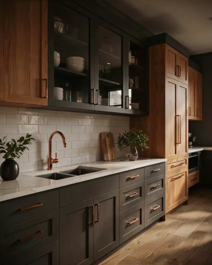
You’re standing in the paint aisle with a copper knob in one hand and a fan deck in the other, and somehow nothing feels right. I’ve been there, specifically with a set of copper sconces that turned a perfectly nice greige into something that looked like tarnished afterthought. But copper accents don’t need to be a headache. They need a boho paint palette with enough warmth to embrace that rosy glow instead of fighting it. For a whole house color scheme, Sherwin Williams has a surprisingly forgiving lineup of earthy tones that make this work, and I’m going to walk you through exactly how to put it together.
What Makes a Boho Paint Palette Work With Metal Accents
The secret is not about matching wood tones or copying a Pinterest photo. It’s about undertones. Copper has that pinkish orange glow that clashes with cool gray and goes muddy next to pure white. So your walls need to carry some of that same warmth, but not so much that everything turns into a pumpkin patch.
Look for colors with a clay, sand, or ochre base. Those are the ones that sit happily next to copper without either one shouting. And here’s the thing, you don’t need a heavily saturated color everywhere. Even a light warm neutral will do the heavy lifting.
A boho paint palette should feel like it came out of the ground. Think sunbaked stone, dusty red rock, faded adobe. That’s the family you’re shopping in.
The Sherwin Williams Colors I Keep Recommending
Not gonna lie, I’ve painted my own bathroom twice because I ignored this list the first time. Here’s what actually works with copper accents in a whole house color scheme:
- Kilim Beige, a soft sandy neutral that never goes flat
- Cavern Clay, the terracotta sister you’ll want for an accent wall
- Gobi Desert, which is lighter and more airy but still warm
- Rookwood Clay, a deeper brick tone that makes copper look like jewelry
- Accessible Beige, the reliable pick for hallways and open areas
These are not just random beige blobs. Each one has that subtle orange or pink undertone that copper loves. I’d stay far away from anything named “greige” or with a blue base, because that’s how you end up with mismatched metal and sad walls.
Building a Whole House Color Scheme Without Clashing
Pick one main color for the largest walls, like Kilim Beige, and let it carry through the living room and hallway. Then choose a deeper accent color, Cavern Clay works great, for a single feature wall in a dining area or bedroom. Third, bring in a tiny third shade, maybe Gobi Desert, for trim or a built-in nook.
That three-step formula is the whole house color scheme. It’s boring to say, but it works. You get flow from room to room without every space looking identical.
Copper accents can then pop in as light fixtures, hardware, or even a small bowl on a shelf. Because the walls are already in that warm family, the metal reads as intentional, not accidental. It’s like wearing a tan jacket with a copper necklace, they just belong together.
How to Test Copper Accents Against Your Paint Swatches
Do not test paint colors on a tiny square near the floor. That’s a waste of an evening. Instead, paint a large piece of foam board, at least two feet by three feet, and lean it against the wall. Then hold your actual copper accent, a candleholder, a lamp base, a drawer pull, right up against that board.
Move the whole setup around the room at different times of day. Morning sun hits copper differently than evening lamplight. And this is the mildly annoying part, but you have to do it for every room. What works in your bright kitchen might feel off in a dim hallway.
Here’s a trick that has saved me more than once: put a small piece of copper tape directly on the painted board. Then walk to the other side of the room. If the copper disappears into the paint, you’ve got too much match. If it stands out like a sore thumb, you’ve got too much contrast. The sweet spot is a gentle shimmer, not a roar.
Earthy Home Decor Touches That Tie It All Together
Copper accents are only one layer of an earthy home decor setup. You also need textures that repeat the same tones. Think woven rattan, rough linen, low-fired pottery, and unglazed ceramics. A single piece of copper can look lonely if everything around it is too smooth or too cool.
Pair your walls with natural wood furniture that has red or orange streaks in the grain. Oak and cherry read well here. Walnut can work but it has more purple to it, so test it beside your copper first.
And don’t forget the floor. A plain beige carpet might fight your boho paint palette, but a jute rug or something with a subtle terracotta stripe will make the whole scheme sing. Textiles are the easiest way to add warmth without another coat of paint.
What I’d Skip With This Sherwin Williams Palette
You might be tempted to throw in a blue accent pillow because you saw it on a moodboard. Don’t. Blue is the direct opposite of copper on the color wheel, and while that can feel lively in small doses, it also kills the cozy boho vibe you’re building. Cool grays are the other common misstep. They read as dirty next to these warm walls.
Skip anything with a crisp, sterile finish in the same room. Shiny white plastic outlet covers, bright white baseboards, or a glossy white ceiling. Replace those with an off-white or a slightly creamy tone. I learned this the hard way when my brand new copper pendant looked like a mistake against my bright white trim.
Also skip the urge to paint every wall a different terracotta. Two or at most three paint colors across a whole house is plenty. Copper accents do the rest. Save your energy for the lighting.
At the end of the day, this whole scheme comes down to one simple shift: stop matching exact shades and start matching emotions. Warm beige and dusty clay will always have your back. So grab a few sample cans, find a copper object you love, and enjoy the messy process of testing in your own light. You’ll know it’s right when the paint feels like a background, not a loud comment. Save this palette for your next paint day and let the copper shine on its own. I’d love to know which Sherwin Williams color ends up in your living room, so come tell me what you picked. 🧡
This post was researched and drafted with AI assistance, then personally reviewed and edited by Copper Finds Vera before publishing.
Leave a Comment