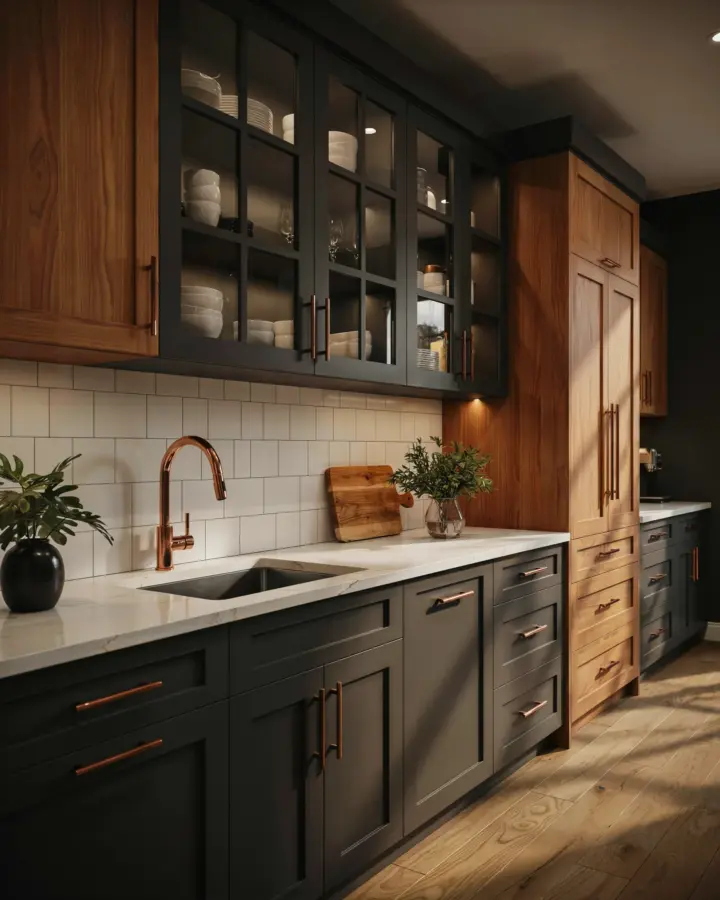
If you have been searching for a way to bring warmth and personality into your home, this copper accents paint palette might be exactly what you need. I have been experimenting with earthy boho Sherwin Williams color schemes for years, and the combination of deep wall paints with metallic copper details never gets old. It feels grounded yet glamorous without trying too hard. This palette works for a whole house because the colors flow from room to room, creating a cohesive story that is both moody and inviting. Whether you are planning a full renovation or just refreshing a single room, these paint ideas will give you a solid foundation.
Rich Wall Paints That Anchor a Bohemian Living Room
When I think about a boho living room, I want colors that feel like they have been there forever. Rich wall paints such as Sherwin Williams Urbane Bronze or Poised Taupe create a cocooning effect that pairs beautifully with brass and copper fixtures. These shades are not flat; they shift in different light, which keeps the space interesting. For a truly earthy boho vibe, I recommend a deep terracotta like Rookwood Terra Cotta. It brings in the clay tones of the desert while still feeling sophisticated.
Copper accents (think pendant lights, picture frames, or even a copper coffee table) pop against these darker backgrounds. The contrast is subtle enough to feel intentional, not dramatic for drama’s sake. If you worry about a room feeling too dark, balance the walls with natural textures: linen curtains, a jute rug, and plenty of green plants. That is the secret to making rich paint feel lived in rather than heavy.
Deep Jewel Tones That Add Drama Without Noise
Jewel tones are a natural fit for a copper accent palette because they share that same opulent, mineral quality. I have used Sherwin Williams Naval (a deep navy) in a dining room paired with copper hardware, and it looked like a gemstone setting. Another favorite is Greenblack, which sounds scary but reads as a dark forest green with a hint of charcoal. It makes copper candle holders or a copper mirror frame absolutely sing.
Here are a few deep jewel tones that work well with copper accents:
- Deep Emerald (Sherwin Williams Rookwood Jade or similar): pairs with aged copper for a vintage look.
- Amethyst Plum (like Sherwin Williams Plum Dandy): cozy and unexpected, especially in a bedroom or reading nook.
- Indigo Blue (Sherwin Williams Indigo Batik): adds a cool contrast to warm copper, perfect for a home office.
These colors are intense, so I suggest using them on a single feature wall or in a smaller room first. You can always expand later if you love the effect.
Dark Bold Paints for Dramatic Interiors That Feel Collected
Some people shy away from dark bold paints because they fear a cave. But with copper accents, dark walls become a backdrop for light and texture. I painted my
#CopperAccents #BohoPaintPalette #SherwinWilliams #WholeHouseColors #EarthyBoho
This post was researched and drafted with AI assistance, then personally reviewed and edited by Copper Finds Vera before publishing.
Leave a Comment