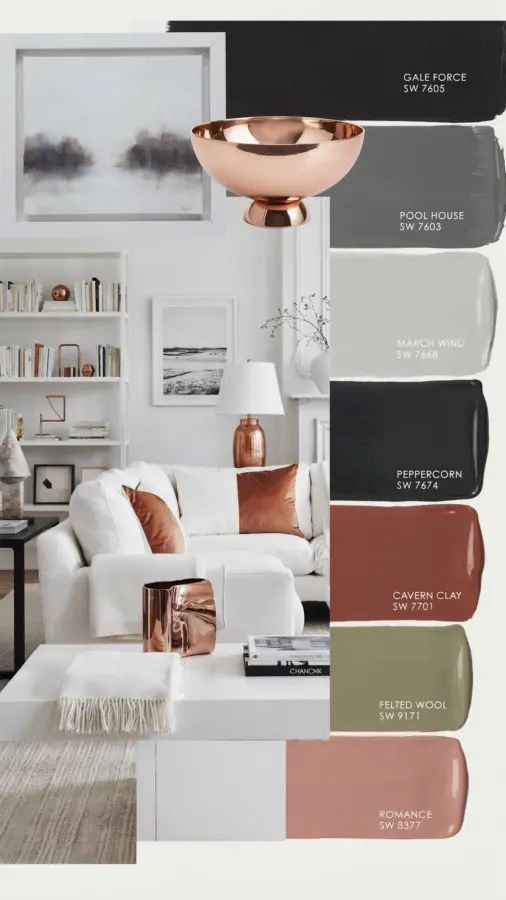
When I first considered copper living room accents with an earthy Sherwin-Williams palette, I wasn’t entirely sure the combination would feel as warm and grounded as I hoped. It did. After living with this color scheme for a year, it’s become my go-to recommendation for anyone wanting a space that feels both cozy and intentionally put together. Here’s what actually worked, what surprised me, and how you can make these neutral hues with copper touches feel like home.
Why Copper and Earthy Neutrals Work Together
The secret to a successful earthy living room lies in contrast. Copper brings a soft, pinkish-gold glow that can read as either warm or cool depending on its surroundings. Pair it with deep charcoals and soft greys, and the copper becomes a gentle highlight instead of a bright flash. I found that Sherwin-Williams neutrals like Gale Force (a muted sage-grey) and March Wind (a pale warm grey) provide a calm base that lets copper fixtures and decor breathe without competing.
Unlike brass or gold, copper doesn’t steal the show. It sits quietly next to darker tones like Peppercorn (a rich charcoal) and Cavern Clay (a warm terracotta), creating a layered look that feels natural rather than staged. If you’re aiming for a neutral home decor scheme that still has personality, this palette is almost foolproof.
How I Chose the Sherwin-Williams Palette
I started by testing samples on large poster boards taped to my living room walls. The goal was to find five shades that flowed from one to the next without feeling flat. Here’s the combination I settled on:
- Gale Force (SW 7605) – a soft, weathered sage that shifts from green to grey depending on light
- March Wind (SW 7654) – a barely-there warm grey, perfect for ceiling or trim
- Peppercorn (SW 7674) – a true charcoal with no blue undertones
- Cavern Clay (SW 7701) – a muted terracotta that leans brown, not orange
- Felted Wool (SW 9148) – a creamy off-white with a whisper of beige
I painted the main walls in Gale Force, used March Wind on the ceiling, and reserved Peppercorn for an accent wall behind the media console. Cavern Clay showed up in throw pillows and a small ottoman, while Felted Wool kept the furniture upholstery light and airy. The result felt cohesive without being monotonous.
Using Gale Force and March Wind on Walls
Gale Force is one of those colors that looks different every hour. In the morning it reads mostly grey with a green tint; at sunset it glows almost sage. I worried it might feel cold, but the copper accents fixed that. A pair of copper sconces on each side of the sofa threw a warm light onto the wall, bringing out the subtle green undertones and making the whole room feel forest-inspired.
March Wind on the ceiling was a calculated risk. I wanted a colour that would visually lower the height without making the room feel smaller. It worked perfectly. The ceiling seems to sit closer to the walls, creating an intimate cocoon that complements the copper accents without making the room feel dark. If you have standard 8-foot ceilings, this trick alone is worth trying.
Adding Peppercorn and Cavern Clay Through Furniture
Painting a full wall in Peppercorn sounded intimidating, so I used it on one focal wall behind a low bookshelf. The charcoal acts as a backdrop for copper frames, a small copper lamp, and a ceramic vase. The contrast is dramatic without screaming for attention. For a softer hit of earthiness, Cavern Clay appeared in textiles: a linen throw blanket, two velvet pillows, and a flatweave rug that ties the terracotta to the grey-green walls.
I learned that too much Cavern Clay can make the space feel dusty, so I stuck to about 10% of the room’s visual weight. This kept the living room color palette balanced. If you’re unsure about committing to a full burnt-clay sofa, start with pillows and a rug. You can always add more later.
Felted Wool as a Neutral Anchor
Felted Wool became the backbone of the room. I used it on the sofa fabric (a performance linen blend) and on the base color for the curtains. This shade is not quite white and not quite beige. It has a soft warmth that bridges the grey-green walls and the charcoal accent wall. Without it, the copper elements might have felt disjointed. With it, the whole scheme clicked.
I also painted a small wooden side table in Felted Wool to create a uniform base for a copper tray. The neutral anchor lets the copper stand out while keeping the overall vibe calm. This is why neutral home decor lovers often reach for this color: it works as a canvas for both warm and cool accessories.
Copper Fixtures and Decor That Shine
Not all copper is created equal. I opted for brushed copper finishes (less shiny, more understated) on a floor lamp, a small chandelier above the coffee table, and picture frames. The matte finish picks up the pinkish tones in Cavern Clay and the grey
#CopperDecor #EarthyLivingRoom #NeutralHomeDecor #CopperAccents #LivingRoomColorPalette
This post was researched and drafted with AI assistance, then personally reviewed and edited by Copper Finds Vera before publishing.
Leave a Comment