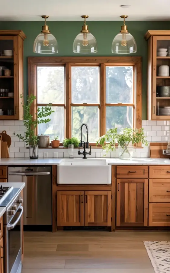
Picture this: a modern farmhouse kitchen with sage green walls, warm wood cabinets, brass pendant lights, and a view of trees through a large window. It’s the kind of space that makes you want to sip coffee and never leave. But honestly, I’ve seen so many people try to recreate this exact look and end up with a hot mess. The problem? They make the same handful of mistakes over and over. So let me walk you through the common pitfalls – and how to dodge them – so your kitchen actually looks like the dream, not a Pinterest fail.
Choosing the Wrong Shade of Sage for Your Walls
That soft sage green wall color in the photo? It looks effortless, but it’s actually tricky to get right. The biggest mistake I see is picking a sage that’s too grey or too yellow under your specific kitchen lighting. I once painted my own kitchen a sage that turned into a muddy olive by afternoon – true story. It looked like baby poop in the midday sun.
Here’s the thing: sage green changes dramatically with natural light, especially if you have a window like the one in this kitchen that lets in tree-filtered light. Always test large swatches on your wall and live with them for a few days. Paint them in a square at least two feet wide. Look at them morning, noon, and dusk. The right sage has a subtle blue undertone that stays calm even when the sun hits it directly. And if your kitchen faces north, go a shade warmer than you think.
Mixing Wood Tones the Wrong Way – Why Your Cabinets Look Clunky
The wood cabinets in this kitchen are natural and warm, with black metal handles. That’s a beautiful combo. But here’s where people screw up: they grab oak cabinets that are too orange, or they pair a cool grey sage with cherry wood that clashes. You want your wood to feel like it grew in the same forest as your wall color. The warmth should complement, not fight.
- Stick to one wood species. In this kitchen, it looks like a medium-tone alder or birch. Pick a wood with a brown undertone, not a red or orange one.
- Match the metal. Those black handles work because they provide contrast without competing with the brass lights. Don’t mix brass hardware with silver hinges – keep all visible metal in the same family.
- Consider the grain. Too much heavy grain on oak can make a small kitchen feel busy. A smoother wood like maple lets the sage wall take center stage.
And a weird personal aside: I once installed cabinets that were too warm and it made the whole room feel like a log cabin – not the cozy farmhouse I wanted. I ended up sanding and glazing them to tone down the orange. Don’t do that to yourself.
Brass Pendant Lights Done Wrong – Size, Height, and Finish Matter
Look at those three glass dome pendants with brass hardware hanging above the white farmhouse sink. They’re gorgeous because they’re big enough to feel substantial, but not so big they overwhelm the window. The most common mistake? Hanging them too high. I see pendants floating near the ceiling like sad little UFOs. They should hang low enough to make a statement – usually 30 to 36 inches above the sink counter.
Also, cheap brass is a nightmare. It tarnishes unevenly and looks brassy in a bad way, like a cheap hotel lobby. Spend the money on real brass or a quality antique-brass finish that will patina gracefully. And for heaven’s sake, clean them regularly. Dust collects on those glass domes fast. (Ok so, I’m slightly obsessive about this – I use a microfiber cloth and a drop of vinegar every month. It takes two minutes.)
The Farmhouse Sink Trap – Why White Doesn’t Always Work for Everyone
That white farmhouse sink with the marble counters? It’s iconic. But here’s the dirty secret: it shows every fleck of food, every splash of coffee, every water spot. People buy one thinking it’ll hide messes because it’s white, but it actually reveals them. I’m not saying don’t get one – I love mine. But you have to be realistic about maintenance.
If you cook a lot of tomato sauce or drink red wine, consider a fireclay sink instead of a cast iron enamel one. Fireclay is more forgiving with stains. And pair it with a matte finish faucet (the brass in this photo works perfectly) because shiny chrome + white sink = a reflecting nightmare of water spots. Another mistake: centering the sink under the window but not leaving enough counter on either side for drying dishes. This photo has good balance – there’s space on both sides for prep. Don’t cram your sink into a corner or you’ll lose all that cozy symmetry.
Subway Tile Backsplash Blunders – Grout Color and Layout Matter
White subway tile is classic, but it’s easy to get wrong. The most common mistake in a kitchen like this? Using bright white grout. I did that in my first house and regretted it every single day – the grout picked up grease splatters and turned a sad shade of yellow within months. In this photo, the grout looks like a warm off-white or maybe a light grey, which stays cleaner-looking much longer.
Another thing: the tile pattern. Standard brick lay is fine, but if you want a little more interest without going crazy, try a vertical stack or a herringbone above the sink area. But don’t mix subway tile with heavy patterns on the counter – marble counters are already busy enough. Keep the backsplash simple. And consider the finish: a matte or satin subway tile will feel cozier than a high-gloss one that looks like a hospital bathroom. Honestly, that glossy tile can make the whole room feel cold, and this kitchen is supposed to be cozy.
Forgetting the Window – How to Enhance That Tree View
That three-pane window with wooden frames and a view of green trees outside is the soul of this kitchen. People make two mistakes here: they cover it with heavy curtains, or they leave it totally bare and forget to frame it. You don’t need to block that light. Instead, use a simple roman shade that sits inside the frame and only comes down when you need privacy.
And here’s a trick that many overlook: place a couple of clear glass pots with small plants on the windowsill, like the ones in the photo. They echo the greenery outside and tie the indoors to the outdoors. But don’t overdo it – three small pots maximum. Any more and it looks cluttered. The goal is to let the view breathe. I’ve also seen people put a huge cutting board or a stack of cookbooks in front of the window. Don’t do that. Keep the sill clean and minimal.
Overdoing the Plants – When Sage Green Walls Clash with Greenery
Sage green walls are already plant-like. So when you add green plants in clear glass pots, like in this photo, you need to be careful. A mistake I’ve made is buying a big fiddle leaf fig tree and placing it against the sage wall – it totally disappeared. The leaves blended right in. Instead, choose plants with lighter green leaves, or put them in white or terracotta pots to create contrast. The glass pots in the photo work because they’re nearly invisible, letting the plant shape shine without adding another color.
Another issue: too many small plants scattered everywhere. Two or three strategically placed ones (one on the windowsill, one on the counter near the sink, maybe a small trailing pothos on top of a cabinet) are enough. More than that and you risk making your kitchen look like a jungle or a nursery. And honestly, who wants to water ten pots every week? Not me.
Final Thoughts: You Can Do This Without the Headaches
This cozy modern farmhouse kitchen with sage green walls and brass lights is totally achievable – just avoid the common landmines I’ve pointed out. Pick the right sage tone, match your wood and metal finishes carefully, don’t rush the pendant light height, and give that sink the maintenance respect it deserves. The window view? Let it be the star. And keep your plant collection tight. Every mistake I’ve made in my own kitchen taught me something, and I hope this list saves you a few trips to the paint store.
Which of these mistakes have you made – or almost made? Drop a comment below, or better yet, pin this article to your next remodel board. Your future kitchen will thank you.
#SageGreenKitchen #FarmhouseKitchen #BrassLighting #WoodCabinets #KitchenDesign
This post was researched and drafted with AI assistance, then personally reviewed and edited by Copper Finds Vera before publishing.
Leave a Comment