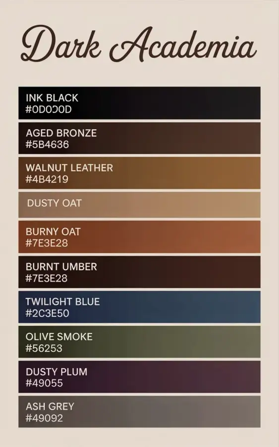
The dark academia color palette has an unfair reputation for being heavy, moody, and difficult to live with. Honestly, that reputation is earned, but only because most people try to use all ten colors at once and then wonder why their living room feels like a tomb. The key restraint isn’t about abandoning the deep browns and inky shades, it’s about learning which ones to feature and which ones to keep quiet. When you get it right, this palette creates a warm, lived-in atmosphere that feels like an old library on a rainy afternoon.
That exact guide you saved to Pinterest, the one with the beige background and the elegant brown cursive title, is a perfect starting point. It lists ten specific earthy tones, from INK BLACK to OLIVE SMOKE, with hex codes for each. But a color palette chart is not a paint-by-numbers plan. It’s a set of ingredients, and just like in cooking, you don’t throw everything in the pot at once. Let’s talk about the common mistakes people make, and how to actually use this specific collection of umber, bronze, and blue without wrecking the vibe.
Mistake #1: Treating Every Earthy Tone as a Wall Color
You see a palette like this and your first instinct is to paint every wall BURNT UMBER. Stop. That specific shade, #7E3E28, is gorgeous, but it is also intensely dominant. If you slather it on all four walls in a standard room, it will swallow the light and make the space feel smaller and darker than you intended.
The better approach is to treat the mid-tones like WALNUT LEATHER and AGED BRONZE as accents for trim, furniture, or a single feature wall. Use the lighter shades, like DUSTY OAT, as your dominant wall color. That warm, muted taupe gives you the cozy backdrop without the cave effect. Reserve the dramatic umbers and browns for your sofa, your bookshelves, or the wall behind your bed. It’s a much more sophisticated way to use the palette, and it stops your room from looking like a sepia photograph.
Copper Home Decor Is the Secret, Not the Main Course
Here’s the thing about copper accents: they only work if they stand out. If you combine them with every other metallic finish you own, they get lost. The whole point of using copper with this specific palette is that the warm, orange-pink glow of the metal contrasts beautifully with the coolness of the twilight blue or the darkness of the ink black.
Pick two or three copper pieces and let them do the heavy lifting. A polished copper floor lamp next to a deep brown leather armchair looks intentional. A small copper vase with dried pampas grass on a dark walnut console table catches the light in a way that feels almost magical. But if you add a copper mirror, copper candle holders, and copper picture frames all in the same room, you’ve created a cluttered theme, not a design. You want to notice the copper, not trip over it.
Using Twilight Blue Without a Strategy
The TWILIGHT BLUE in the palette, hex #2C3E50, is often the most feared color. People look at that deep steel-blue and think it will clash with the warmth of the browns. But honestly, it’s the saving grace of the entire palette. It cools things down just enough that the room doesn’t feel like a musty cave.
The common mistake is using this blue in isolation. A single blue cushion on a brown sofa can look like an accident. Instead, group it. Use a twilight blue throw blanket draped over the arm of a chair, paired with a matching blue ceramic bowl on the coffee table. You need to create a deliberate pool of color for it to make sense. I think it also works spectacularly on a ceiling, honestly. Painting a small study or reading nook ceiling that deep blue adds depth without overwhelming the walls. That’s a pro move people rarely try.
Forgetting the Impact of Ink Black Textures
Okay, so INK BLACK is the easiest color to ignore because it feels like a default. But in this palette, it’s actually the anchor. The mistake is treating #0D0D0D as a boring neutral and skipping it entirely. When you do that, the rest of the colors can feel a little washed out and floaty.
The trick is to use ink black in textures, not in large painted areas. Look for a matte black picture frame, a wrought iron floor lamp, or a dark leather-bound book piled on your coffee table. These little black moments create visual punctuation. They give your eye a place to rest. Without them, the AGED BRONZE and WALNUT LEATHER can blend together and start to look muddy. A few crisp, dark lines hold the entire palette together.
The Real Problem With Dusty Oat Base Walls
Everyone loves DUSTY OAT because it seems safe. It’s warm, it’s neutral, and it pairs with everything. But here’s the mistake: people use it and then stop there. They paint the walls this beautiful, comforting taupe and then furnish the room with generic, mid-century modern furniture from a big box store. The results look beige, not styled.
If you’re going to use that oat color as your main wall, you have to commit to the dark academia story in the furniture. You need the heavier woods, the vintage brass details, and the textured fabrics like linen or velvet. The DUSTY OAT is just the quiet background that lets those darker elements sing. Lean into the moody accessories. A large framed art print with a dark botanical subject or a pair of vintage brass candlesticks will immediately add the character that the base color alone can’t provide.
Let’s break down a simple starting shopping list for a cozy, copper-accented corner:
- One large floor lamp with a copper stem and a simple linen shade.
- A throw pillow in TWILIGHT BLUE to sit against a brown leather sofa.
- A small, hammered copper bowl to hold keys or jewelry (it patinas beautifully over time, which adds to the vintage feel).
- Somewhere to stack three or four old hardcover books in deep browns and blacks; they are literally the cheapest decor item that anchors the palette.
Recreating the Palette Guide’s Natural Structure
You don’t need to be a professional decorator to pull this off, you just need to respect the structure. The palette guide in the photo doesn’t randomly mix colors, it starts with INK BLACK, touches on the deep leathers, passes through the dustiness of the oat, and then introduces the cool blue and the olive at the end to keep things from getting too hot.
When you lay out your room, take the same approach. Start with the darkest anchor piece, maybe a black bookshelf or a deep umber rug. Layer in the leather and the bronze with the furniture. Use the DUSTY OAT or the lighter tones for the larger surfaces like the sofa or the walls. Then, finish with the smaller pops of the twilight blue and the OLIVE SMOKE (#5E6253). This order creates rhythm, so your eyes move through the space smoothly instead of seeing a chaotic pile of browns.
Practical Tips for the Accent Finishing Touches
So you’ve painted the walls, you’ve got the furniture placed, and you’re staring at the room wondering why it looks a little flat. This is the moment where people make the final fatal mistake: they add too many things. They see a copper accent wall on Instagram and try to replicate it, or they buy five different copper accent pieces hoping one will work.
Instead, look at what the light does. A copper vase only shines if it’s actually in a path of light. Put it on a windowsill or near that lamp you already have. Think about scale. A tiny copper trinket on a giant oak coffee table is a waste of money. Go for one statement piece like a tall, curved copper floor sculpture or a generously sized bowl. You’re creating a focal point, not a display shelf.
Anyway, the goal is warmth, not a theme park. The palette itself does all the heavy lifting if you let it. You just have to step back and let the earthy tones and the copper do their quiet, beautiful work together.
Eventually, you will find a balance that feels right for you. There is no perfect formula, but if you stick to the basics, use the copper sparingly, and let the deep tones ground the space, you’ll create a room that feels like a story. If you found this helpful and want to pin this specific palette breakdown to reference later, go ahead and save it. It’s a good one to come back to when you’re standing in the paint aisle feeling overwhelmed by those little paper swatches.
This post was researched and drafted with AI assistance, then personally reviewed and edited by Copper Finds Vera before publishing.
Leave a Comment