My First Attempt at an Earthy Living Room Color Palette
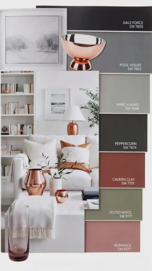
I remember the day I finally decided my living room needed a change. I had been staring at beige walls for three years. Honestly, beige is fine, but it was doing absolutely nothing for me. So I sketched out an earthy living room color palette using Sherwin-Williams paints. The combination of Gale Force, March Wind, Peppercorn, Cavern Clay, and Felted Wool felt risky at first. But once I saw it on the walls, I knew I had stumbled onto something special.
Let me be clear. I am not a professional designer. I’m a person who spends too much time on Pinterest and has a mild obsession with paint samples. Those little paper squares? I have a drawer full of them. It’s almost embarrassing. Anyway, this palette worked better than I ever expected. The copper accents were the last piece I added, and they pulled everything together in a way that felt warm, not forced.
Sherwin-Williams Gale Force and March Wind as the Cool Neutral Backdrop
Gale Force appears on the swatch as a soft, grayish blue. It is not a bright blue. It is more like the color of a hazy winter sky right before sunset. I painted the two largest walls in my living room with Gale Force. At first I worried it would feel cold, but it actually recedes, making the room feel bigger and calmer.
Then came March Wind. This is a pale, warm gray with just a whisper of green undertone. I used it on the remaining walls and the ceiling. Together, these two colors create a subtle contrast that changes throughout the day. In morning light, Gale Force looks almost lavender. In the evening, under warm lamps, it settles into a soft stone. March Wind stays consistent, like a trusted friend who never changes the subject. And the best part? They don’t fight each other. They just sit there, quiet and supportive.
Using Peppercorn and Cavern Clay as Grounding Accents
Peppercorn is not black. It is a deep charcoal that has warmth in it, like graphite mixed with a drop of espresso. I used it on the window frames and the baseboards. Some people paint trim white, but that felt too stark here. Peppercorn grounds the room without making it feel heavy. It also hides dust pretty well, which is a bonus I did not anticipate.
Cavern Clay is the wild card. Honestly, I was nervous about this one. It is a terracotta shade, but not a bright, punchy orange. More like dried clay after a light rain. I painted the back of a built-in bookshelf with it. That small pop of warm earth is exactly what the room needed. Without Cavern Clay, the palette would have been too safe. With it, the room has a pulse. And every time I walk past, I catch myself looking at that warm patch like it’s a secret I get to keep.
Copper Accents That Add the Right Warmth Without Screaming
Adding copper to a neutral room feels obvious in theory, but in practice it is easy to overdo. I started small. A copper floor lamp from a thrift store. A simple hammered copper bowl on the coffee table. Then a pair of curtain rods in a brushed copper finish. That was it. Three things. Ok so here is what surprised me: the copper does not compete with Cavern Clay. They speak the same language but at different volumes.
Here is a quick list of copper accents that worked for me without looking like a store display:
- One large copper tray on the ottoman (holds remotes and a candle)
- A single copper-framed mirror above the console table
- Copper-legged side table (just the legs exposed, not the whole table)
- Candle holders in mixed finishes, two copper, one brass
- Copper wire basket for throw blankets (functional and casual)
The key rule I followed: copper should be a wink, not a stare. If I had added copper vases, copper picture frames, and a copper chandelier, the room would have looked like a craft store explosion. But keeping it to a handful of purposeful pieces made the warmth feel intentional.
Felted Wool as the Soft Finishing Touch
Felted Wool is Sherwin-Williams’ gentle off-white. It is not stark white. It has a slight greige undertone, like oatmeal that sat in the bowl for an extra minute. I used it on the ceiling, actually. And on the inside of the built-in shelves that I did not paint with Cavern Clay. Felted Wool marries the cool tones of Gale Force and the warm clay of Cavern Clay without trying to be the star.
I also picked a Felted Wool area rug from a home goods store. That was a total accident. I ordered a rug online that was supposed to be cream, and when it arrived, it was exactly Felted Wool. Not gonna lie, I was annoyed at first. But now I think it was fate. The rug ties the floor to the walls in a way that a darker rug would have broken. Sometimes happy accidents save you from yourself.
One Weird Thing That Made All the Difference (a Personal Tangent)
I have a mild obsession with paint sample jars. You know the little ones that cost like five dollars? I bought four of them, one for each color in this palette except Cavern Clay. And then I forgot to return them. So they sat on my kitchen counter for three weeks. Every morning I would pick them up, shake them, and hold them against different pieces of fabric. I spilled Gale Force on my favorite jeans. The stain is still there. But that little ritual of mixing and matching the colors physically, not just on a screen, gave me the confidence to commit to the wall. It sounds silly, but handling the actual paint, feeling its weight, seeing it dry on a cardboard swatch, that is what settled my nerves. You cannot get that from a digital render.
Anyway, that spilled paint did not ruin the jeans. It just made them more interesting. Now they are my “paint jeans” and I wear them every time I start a new project. It’s a weird little ritual, but it works.
Balancing the Cool and Warm Tones in Your Own Space
If you try this palette, pay attention to the light. My living room faces east, so morning light makes Gale Force look almost blue. In the afternoon, when the sun moves, the room feels warmer because of the Cavern Clay and the copper. If your room faces north, you might want to add more warm light bulbs. A 2700K LED bulb is your best friend. It keeps the cool grays from becoming chilly.
Also, do not be afraid to swap out the copper for something else. Rose gold? Bronze? Even brushed gold. The principle is the same. You need one metallic accent that has red or orange undertones to connect with the Cavern Clay. Silver or chrome would clash. So just keep that undertone in mind. That is the only rule. Everything else is flexible.
This palette taught me that neutral does not have to mean boring. It can be layered, textural, and alive. The combination of Gale Force, March Wind, Peppercorn, Cavern Clay, and Felted Wool is not something you see in every magazine. But it is something you feel when you walk into the room. Calm. Inviting. Like the room has been there for years, even if the paint is still fresh.
If you decide to try it, let me know how it goes. I would love to hear about your own copper discoveries. Or your paint-stained jeans. Either one. Share in the comments or tag me on Pinterest. I am always up for a new color story.
#EarthyLivingRoom #SherwinWilliamsColors #NeutralHomeDecor #CopperAccents #WarmNeutrals
This post was researched and drafted with AI assistance, then personally reviewed and edited by Copper Finds Vera before publishing.
Leave a Comment