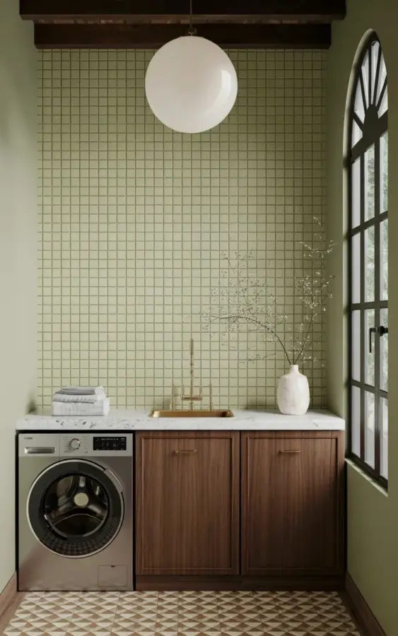
I keep seeing that photo floating around Pinterest – the one with the sage green tile laundry room, dark cabinets, and that killer geometric floor. And honestly? I get it. That space is pure magic. But here’s the thing I’ve learned after helping a few friends (and myself) try to copy this look: it’s easy to screw up. Real easy. So I’m going to walk you through the biggest mistakes I’ve seen people make when trying to nail this vintage copper-and-brass vibe. Because you deserve a laundry room that actually looks like the inspo pic, not a half-baked knockoff. Let’s get into it.
The Mistake of Picking the Wrong Sage Green Shade
Not all sage is created equal. I once painted a batch of sample tiles a shade that was supposed to be “sage” but came out looking like the green in a hospital waiting room. Depressing. The trick is to look at the undertone. You want a sage that leans slightly gray or blue, not yellow or olive. In the photo that’s everywhere right now, those small square tiles are a cool, muted sage – they sit quietly against the dark wood and let the brass handles do the talking.
If you pick a warm sage with yellow undertones, it will clash with the copper tones. You’ll get a muddy mess. My advice? Buy a few actual tile samples, stick them on your wall, and live with them for a few days. Look at them in morning light, afternoon light, and that weird yellowish light you get from a bad laundry room bulb. The right sagegreentile will shift but never feel sickly. And if you’re going for that exact grid pattern of small squares, make sure the grout is a light gray or off-white – anything darker and the whole wall turns into a heavy blob.
Messing Up the Metal Mix: Brass, Copper, and Chaos
Ok so the photo has warm brass handles on the cabinets and copper accents scattered around. That works because they’re both warm metals with a similar level of sheen. But people go wrong when they throw in chrome, brushed nickel, or god forbid, gold that’s too yellow. It becomes a metal circus. Here’s what I’ve found works:
- Stick to one dominant metal for hardware – brass handles on the cabinets, brass hinges if you can find them.
- Bring copper in through smaller items: a copper faucet, a copper wire basket on the counter, maybe a copper tray for your detergent bottles. Not a copper backsplash. Please.
- If you have a silver/gray washing machine (like in the photo), that’s a cool metal. That’s fine. Let it be the exception. Don’t add more cool metals elsewhere.
The phrase brasshardware gets thrown around a lot. But it’s not just about buying any brass knob. Look for antique brass or unlacquered brass – something that will patina a little over time. That adds to the vintage feel. Shiny polished brass looks too 1990s builder-grade in this context.
Forgetting the Floor Matters as Much as the Walls
That geometric checkered floor in beige and brown? It’s not an afterthought. It’s literally grounding the entire room. People try to cheap out with a vinyl peel-and-stick that has a fake tile pattern, and it never looks right. The pattern in the photo is subtle – the beige is warm, the brown is rich, and the geometry is balanced. Not too busy.
If you’re on a budget, I get it. But here’s a move that works: find a large-format vinyl tile that mimics a cement or stone checkerboard, then have it installed in a pattern that repeats every two tiles. Avoid those tiny diamond patterns that look like a quilt gone wrong. And for the love of everything, don’t use gray and white checkers. That’s a completely different vibe (mid-century modern, not vintage laundry room). The laundryroomdecor in the inspo pic relies on that warm, earthy floor to tie the sage and wood together.
Bad Lighting Kills the Whole Vibe
Notice the big white spherical pendant light? That’s not just pretty – it’s strategic. A single large round shade distributes soft light without harsh shadows. And it’s white, so it doesn’t compete with the green tile or the brass. I’ve seen people try to save money by sticking with a flush-mount boob light from Home Depot. Don’t. That ruins the vintage feel instantly.
Also, the light bulb matters more than you think. Use a warm white LED with a color temperature around 2700K to 3000K. Anything above 3500K will make your sage green tile look cold and your copper accents look dull. And if you have that tall arched window with black frames like in the photo, you’re lucky – natural light bouncing off white marble makes the whole room glow. If you don’t have that window, add a mirror opposite the light source. It’s a cheap trick that works.
I’m not gonna lie, I once used a daylight bulb in my own laundry room and my copper basket looked like a brown paper bag. Learn from my mistake. The vintagestyle depends on warm, inviting light – not a surgical suite.
Choosing Cabinets That Fight the Vintage Feel
Dark wood cabinets with brass handles – yes, that’s in the photo. But people pick dark wood that’s either too red (like cherry) or too orange (like cheap oak). The cabinets in the inspo pic are a rich, chocolatey brown with a matte finish. Probably walnut or a dark-stained maple. That works because it’s neutral enough to let the brass pop.
Another mistake: slab doors. Flat-front cabinets look modern and minimal, which clashes with the vintage tile and floor. You want Shaker-style doors or something with a simple inset panel. Nothing too ornate – just enough detail to feel old. And the brass handles should be something with a bit of weight to them. Hollow cheap ones will feel flimsy. Go for solid brass or a heavy zinc alloy with a good finish. When you pull open a cabinet, it should feel substantial. That’s the kind of brasshardware that makes a room feel curated, not assembled.
Overdoing the Copper Accessories
Look, copper is gorgeous. But it’s also a strong personality. The inspo room has copper tones, not a copper explosion. You don’t need a copper trash can, copper shelving, copper knickknacks on every surface, and a copper light fixture. That would look like a steampunk nightmare. The beauty of copperhomedecor in this setup is restraint – a copper faucet, a small copper vase, maybe a copper edge on a shelf.
And here’s a weird little personal thing: I tried putting a copper drying rack over my sink once. Within a month it had weird spots and greenish stains because the water reacted with the metal. Not a good look. So think about practicality. Copper that touches water needs to be sealed or you’ll get patina fast. That patina can be beautiful if you plan for it, but if you wanted shiny copper, you’ll be disappointed. In this context, aged copper works. So don’t fight the natural tarnish. Let it happen, or buy pre-aged pieces.
Anyway. The main point: let the sage green tile and the dark wood be the dominant visual weight. Copper is a seasoning, not the main dish. Sprinkle it in.
So there you have it. The dream laundry room in that Pinterest photo is totally achievable, but it takes a bit of thought. Avoid these seven mistakes and you’ll be well on your way to a space that feels both vintage and intentional. Got a laundry room project planned? I’d love to hear what tile or hardware you’re considering – drop your picks in the comments below.
#laundryroomdecor #copperhomedecor #brasshardware #sagegreentile #vintagestyle
This post was researched and drafted with AI assistance, then personally reviewed and edited by Copper Finds Vera before publishing.
Leave a Comment