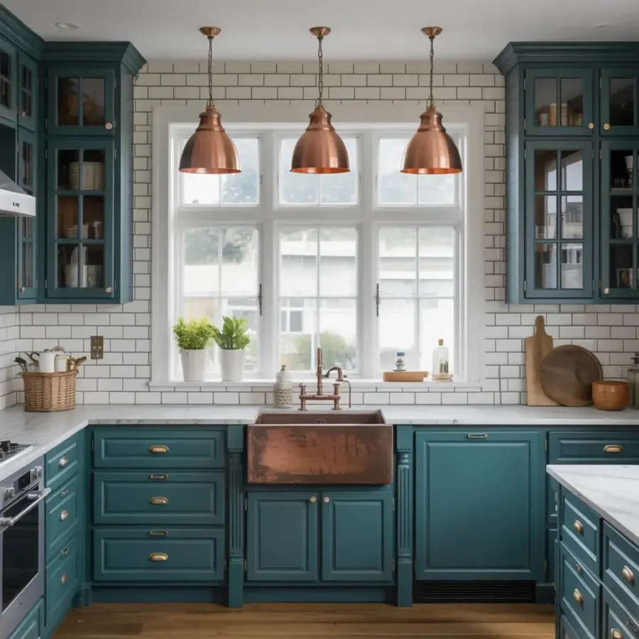
We finally finished our kitchen renovation and I’m honestly still walking in there just to stare at the teal kitchen cabinets. Deep teal against white subway tile, a copper farmhouse sink that catches the light, brass hardware on every drawer, it’s the kind of modern farmhouse transformation that makes you want to cook just to hang out in the room. But here’s the thing: this look doesn’t happen by accident. We made a handful of mistakes along the way, and I want to tell you exactly what to avoid so your teal kitchen turns out as good as ours did (or better, honestly). Because when I see bloggers post that perfect copper-and-teal shot, they don’t show you the panic of picking the wrong shade the first time. Let’s fix that.
Picking the Wrong Shade of Teal for Your Modern Farmhouse Kitchen
Ok so not all teals are created equal. I almost went with a bright, almost turquoise color because it looked fun on a paint chip. Big mistake. That shade screamed “beach house” not “modern farmhouse” and it completely clashed with the warm copper pendants we had already ordered. The deep teal we ended up with, think along the lines of Benjamin Moore’s “Hale Navy” but with more green undertone, creates a grounded, moody base that makes the white subway tile pop. If you’re going for that cozy yet fresh feel, avoid anything too bright or too cold. Look, you want a teal with enough black in it to feel rich, not electric. Test a big swatch on your cabinet door and live with it for a weekend. That saved us.
Common Mistake: Pairing Teal Cabinets with the Wrong Subway Tile
White subway tile is a classic modern farmhouse move, but I see so many people choose a glossy, white-on-white tile that washes out against deep cabinets. Our tile is a matte finish with subtle variation, not perfectly flat white, almost a soft eggshell tone. And the grout? That’s where people trip up. Bright white grout next to teal cabinets creates a jarring contrast, like a grid pattern that fights with the copper accents. We used a warm, off-white grout (like “Bone” from Mapei) and it makes the tile feel integrated, not added on. One more thing: larger subway tile (4×12 instead of 3×6) gives a more updated, less builder-grade feel. Just a personal opinion, but it makes a difference.
Copper Accents: Don’t Overdo It (Yes, Even with That Beautiful Sink)
Here’s a weird thing nobody tells you: copper can feel overwhelming fast. Our farmhouse sink is a solid copper apron-front from Native Trails, it’s gorgeous, don’t get me wrong, but if we had also done copper cabinet pulls, a copper faucet, and copper light fixtures, the room would look like a steampunk fever dream. We limited copper to two statement pieces: the sink and the three large dome pendants above it. Everything else, the cabinet hardware, the gooseneck faucet, is unlacquered brass. That warm brass glow ties the copper in without matching it. I actually made the mistake of buying copper knobs first, installed one, and immediately returned them. Too much. So: pick one hero copper element, maybe the sink, and let brass or nickel handle the rest. Your eye needs a break.
- Copper farmhouse sink: hero piece, anchors the room
- Three copper dome pendants: repeat the color in lighting above the sink
- Brass cabinet pulls and faucet: warm contrast, not identical
- Skip copper hardware on lower cabinets, it gets lost against the dark teal
Hardware That Ruins the Flow (and How Brass Saved Our Remodel)
Before we settled on brass pulls, we tried matte black. Looked fine on the white uppers but completely disappeared against the teal lowers. Then we tried polished nickel, nice, but too cool and silvery for the warm copper vibes we wanted. The brass pulls (we used a satin brass, not super shiny) are like the perfect middle sibling. They pick up the warm tones in the copper pendants and also echo the brass faucet. A mistake I see often: mismatched metals because someone fell in love with three different finishes. Pick a family of warm metals (copper, brass, bronze) and stick to two at most. And honestly, don’t overthink the knob vs. pull debate. For lower cabinets, long pulls feel more substantial and modern. Knobs on upper doors only. That’s what we did and it looks intentional.
Countertop Choices That Can Kill the Whole Look
Our countertops are white marble with subtle gray veining, not the dramatic, bold veins that scream “look at me,” just a soft wispy pattern. If you choose a busy quartz with giant speckles or a dark granite, you’ll fight the teal cabinets for attention. The whole point is that the cabinets and the copper sink are the stars. We almost went with a Carrara marble lookalike in quartz (Caesarstone’s “Empira White”) which is practical and low-maintenance, but we splurged on real marble because I’m a sucker for patina. Don’t do that unless you love stains. A solid white or very light gray countertop keeps the focus where it belongs. One more mistake: thin countertops (like 1.5 cm) look cheap against thick shaker cabinets. Go with at least 2 cm, preferably 3 cm, for that substantial farmhouse feel.
Lighting Placement: The Pendant Mistake Everyone Makes
I’m gonna be real: we hung our copper pendants too high the first time. Like, six inches above where they sit now. Looked like little flying saucers hovering near the ceiling. The rule of thumb for pendant lights over a sink or island is 30 to 36 inches from the countertop, but we have a farmhouse sink that sits a bit lower, so we adjusted to about 28 inches. The goal is to have the bottom of the pendant at eye level so you see the copper color and the dome shape when you stand at the sink. Also, three pendants over a single sink? Yes, absolutely. It sounds excessive but it creates a rhythm, and the light bounces off the brass hardware and teal cabinets in a way that feels layered. Don’t use a single big fixture, breaks the scale. That three-pane window above the sink, by the way, is a perfect anchor. Natural light pours in and makes the teal look different at noon versus dusk. Name a better combo: deep teal, sunlight, copper glow. I’ll wait.
Before and After: What We Learned (and What You Can Steal)
Our old kitchen was builder-grade honey oak cabinets, beige laminate counters, and a cheap stainless sink. The transformation to teal cabinets, white subway tile, and that copper sink felt like swapping a rental for a home. But the real lesson is: planning the color relationships, teal, copper, brass, white, warm gray, made all the difference. If you’re thinking about a modern farmhouse kitchen remodel with teal and copper, start with the cabinets, then the sink, then let everything else follow in a supporting role. Resist the urge to add too many trendy elements. Stick with two metals, one bold cabinet color, and a neutral everywhere else. And test your paint on an actual cabinet door, not a wall. Seriously. Saved us from a turquoise disaster. We learned the hard way so you don’t have to. Happy to answer questions in the comments, what’s your biggest hesitation with teal cabinets? Let me know.
#tealkitchen #modernfarmhousekitchen #kitchenbeforeandafter #copperkitchen #farmhousesink
This post was researched and drafted with AI assistance, then personally reviewed and edited by Copper Finds Vera before publishing.
Leave a Comment